design.
Though the Pathfinder is an online newspaper and does not have a print version, that doesn’t mean that there aren’t opportunities for design. If you travel to our website, you’ll find that much of our design is found in our feature photos, infographics, and site layout.
feature image composition gallery.

I have designed and compiled many feature photos. I take inspiration from the topic and aim to have a feature photo that either fits the topic or the title in terms of mood when designing/compiling the end result, where I make sure all elements are cohesive.
I leverage contrasting colors to draw the eye towards the dominant element, which is an element I use consistently when designing.
Choosing color palettes that build on the mood of each story is super important as well. I choose color palettes that reflect the story's mood, select fonts that complement the visuals, and check that every component I’ve used in the design resonates with the central message of the article and topic. For example, for “They can’t be trusted,” I used a muted color palette that mimicked the numerous campaign advertisements. I also noticed that a lot of commercials and conspiracy-type documentaries used typewriter font as a stylistic choice, so I incorporated that into the story as well.
In “The price of unequal education,” I used two copies of the same statue facing the opposite way to create a sense of balance in the picture. Actually, it created balance, alignment, unity, and contrast, all in the same photo, all by the same adjustment.
Feature image design is not just about being aesthetically pleasing; it's about using visual elements to communicate a story, inform the audience, and evoke emotions. By utilizing these elements of design, feature images can become powerful tools that enhance the Pathfinder’s journalism impact and leave a lasting impression on our readers.
interactive designs.
During my time on the Pathfinder, I’ve found that engagement with our audience causes people to remember information better, so I actively seek out tools that my audience will interact with. A significant aspect of design is composition. As a writer, I have designed many graphics. Many of these graphics have been infographics or interactive elements that go beyond the text on the Pathfinder. Here are a few examples of graphics and infographics that I designed!
- Polls and Knightlab -
Polls are an awesome way to get readers involved in a story. I’ve made many polls for the site, and when I create polls, it’s really important to me to have them well-designed. Because our site is red, white, and blue in accordance with our school colors, I made the poll below using similar colors since I didn’t already have a set color palette. In addition, it’s important to place significance/emphasis on certain words by capitalizing and enlarging certain words — like the title — when designing media elements for the audience so that it’s easy for them to understand what to do.
In addition, I also use the phenomenal tool of Knightlab, particularly for maps and timelines. Again, I usually stick to the base colors of red, white, and blue when I don’t have a set color palette in a story. When designing, one of the most important rules of text-based interactive elements is that the text is easy to see and decipher. For this particular Knightlab that appears in “The vilification of Black history is exactly why we need it,” I created two different maps in Canva, realizing that once after I shaded the states’ colors, the abbreviations would not appear as well against the shaded states, so I removed them from the second map. Using contrasting colors — like white against the dark blue — is important to do so that the audience can clearly see the words. For a lot of people, that may seem like intuition, but as an editor, I’ve seen many infographics with dark gray text on a black background, so I encourage my fellow writers to follow these color tips.
- Genial.ly -
When I design infographics, I like to make sure that they blend in with the rest of the story. For example, the reality series “Love is Blind” already had a set design, so I took the overall look of my design of the show — the font and the emphasized purple that’s used throughout “Love is Blind”’s promotional material — while utilizing colors of a similar palette to design the multimedia for our story. I also like to make designs easy for the eye to follow, incorporating lines that lead the viewer through the image. In the Timeline design, I create this with a series of circles, then arrows that lead the eye through each interactive image of the design. In the Awards interactive, I list each of the names vertically in a line to guide the eye through each name. I also incorporate animated transitions so that it’s interactive and engaging for the audience to follow.
In particular, I think that genial.ly is a great tool to implement interactive elements in stories, no matter if it’s a News story or a Features story, because you can do almost anything with it. You can create infographics, charts, slideshows, quizzes, or even just place extra information that didn’t really fit anywhere else in the article. For this reason, I utilize genial.ly in almost all of my longer stories. Check out this interactive I designed with genial.ly in my 25-year anniversary album review of “The Miseducation of Lauryn Hill.” I used a set color palette to make it fit in with the feature photo (which can be seen here!).
web and social media design.
Though I am a Managing Editor for the Pathfinder, I am also a Conceptual Editor. This role entails designing how individual stories will look on each page in addition to scheduling/posting stories.
In order for a story to be published, a 900x600 feature photo is required as well as a marked category, a staff member’s name, and a headline. However, beyond those essential components, the way that a story is designed varies on each individual story. For example, our Flashback Friday series often has multiple multimedia items that need to be placed meticulously on the story page, and it is my job to ensure that each object on the page is where it needs to be and looks good at its assigned position.
After a couple years of a graphic-heavy Pathfinder, we decided to lean away from graphics in feature images on our site. We still do have a few feature images that are graphics — especially in the A&E/Opinions sections — but as a whole, we have largely moved away from graphics in our feature images and are using them more in add-on multimedia.
Instead, for feature images, we use photographs for a more professional and cohesive look.
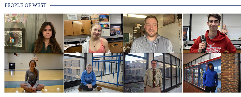
We’ve also kept this approach in mind when designing the flow of our social media pages. Like our website, over time, our social media platforms have taken a more photo-based style. We post the Pathfinder’s Humans of West on especially Instagram to spotlight our student photographers and our community at West.
On our social media, our photographers implement a lot of the color blue, which typically naturally ends up making its way in photographs since it’s one of our school colors.


Before After


However, our social media doesn't just consist of pictures. We've made an effort this year as EICs to utilize more multimedia within our social media.
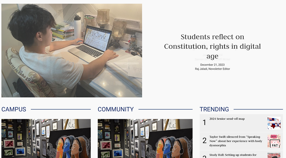
This year, we also redesigned our website. All three of us EICs attended a SNO Design workshop in April, and this helped a lot in terms of giving us ideas on ways to redesign our site. Since our superb EIC Emily Early is in charge of the Site Design and I am Awards Coordinator, we worked together to make these changes. Emily created a new, modernized logo and we tested dozens of fonts to match the headlines and body text to the updated logo.
- Logo -


- Showcase -


- News/Features/Trending Sections -


- Opinions Section -


- People of West v. Humans of West -


- Dropdown Menu -


- Section Changes -


Redesigning the site definitely involved a lot of trial and error. There were nights that we would stare at the screen until our vision blurred trying to come up with designs, but in the end, we really prefer the look that we've taken on for the Pathfinder. It is modern and engaging, and the colors pop while also being fairly colorblind-accessible.
We also lined up the Weekly Poll and Trending Stories widget with the Features and News sections, respectively. We also aligned the Editorials section with the Opinions section for a cleaner, more cohesive appearance.
We also have a dedication to posting at least one section once a week, which is something that we've picked up during our time managing the Continuous Coverage badge. That particular badge required us to post four sections for four consecutive weeks. This weekly posting ensures that the design of our site is consistently updated with new and refreshed content on a regular basis.
Our newspaper utilizes design in every single aspect on our site, and our stories are no exception. Though we don’t design for print, design is carefully weighed upon me as an EIC, and we consider it in every story we publish on the site.
For example, we have various story templates that we use based on each story. We have six templates, but some of our most popular are the half-immersive image template, the immersive image template, and the full-width image template. With the experimentation of these templates, the Pathfinder is able to offer a varied design to our audience so that they aren’t offered the same old design every single time they visit the site. Playing around with each image plays around with the dominance of the design.
For the Features story “A lifelong journey,” we decided to use the half-immersive template, because the picture was great, but we wanted to focus on the main subject of the photo — Dominic Perez. By using the half-immersive photo with this story, we can focus on the subject even more without necessarily cropping it as well as bring the focus to the title. This pairing creates an incredible balance that draws the eye.

In the story “Athletes to watch in 2024-2025 season,” however, we decided that the best focus would be the image itself, thus our decision to stick it under the full immersive image template.

Within the body of our stories, we have created and encouraged our writers to add several elements outside of the traditional text, including pull quotes and infographics. As a Conceptual Editor, it’s my job to ensure that elements outside of the traditional text appear well on the screen, which is something I do by playing around with the given space on the website.
Photo galleries add a bit of variance to many stories, and we utilize them well on the Pathfinder. From school spirit weeks to door decorations, photo galleries can stand on their own or elevate a story with traditional text.

Along with photo galleries, there are other methods we use to diversify our design throughout our stories.
Pull quotes are great elements that SNO lets us implement, especially for longer stories. It’s important that wherever a pull quote goes, it fits smoothly and is somewhat near its actual quote. It should pull the eye but not be a distraction to the reader. Putting a pull quote on the side or in the center with no text around it seems to work well — it offers a break from the traditional text without seeming like an intrusion. To this point, it’s important that there are only a few pull quotes in a story, or else it seems like overkill, both in design and in reading. Pull quotes can be used to contrast from the traditional text, and is an important design element that can be used in stories.

Infographics are significant in digital media. For many people, it can be hard to read text straight as-is, especially on a computer, and in order to make our journalism more accessible, infographics are a great way to both give a break to the eye and a new design element to a story. Within infographics, I edit for spellings, facts, and design. For example, most vertical infographics are aligned to the center, leading the eye down an easy-to-follow path; this is how I’d advise a student who may be struggling with the design of an infographic.

Of course, it’s important to make sure that the infographic balances out with the story’s text, which can be achieved by taking care to resize or shift around the infographic on the page as needed.
More information on how I utilize the web and social media for the Pathfinder can be found on the Audience & Engagement and Marketing page. Many of the ways that we curate, design, and produce content for our website and social media platforms overlap!


